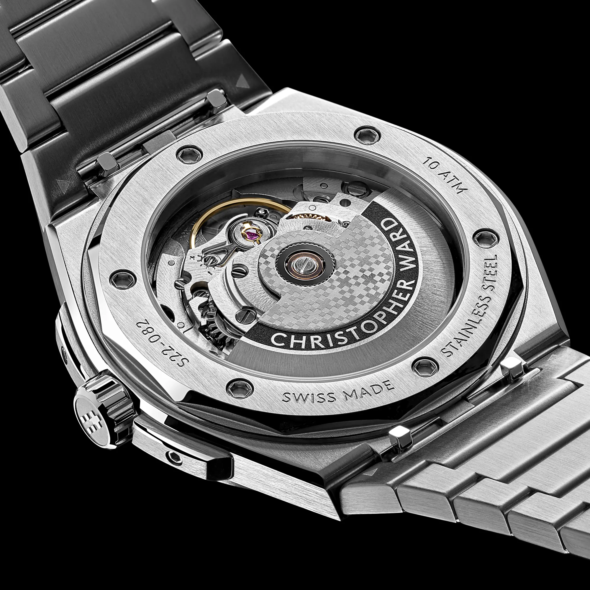
Each of the material options utilize Sellita automatic movements, with the steel getting an SW200 rated to +/- 20 seconds per day, while the titanium gets an SW300 COSC unit, which brings that tolerance to -4/+6 seconds per day. Each set their date complication at 6 o’clock on the dial, with a disc that’s been color matched to the dial. Impressively, they’ve managed to use an exhibition caseback here on both options and still keep the thickness to an absolute minimum.
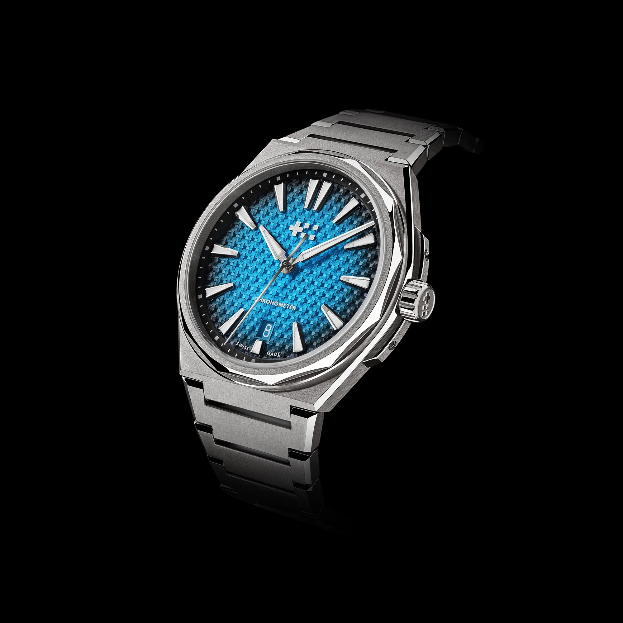
Stepping back to take in the watch as a whole, there’s clear inspiration here from the brand’s referenced in the press materials, but there’s one that’s not, which I happen to find the most similarities to, and that’s the Czapek Antarctique Passage de Drake. That watch features a dial texture, and even colorways, that read very similarly to what Christopher Ward has done with The Twelve, and while that’s not necessarily a bad thing, I’d venture to say that a different texture style or colorways would have created some welcome distance between the two. Of course, the Czapek is north of $20k and not exactly easy to find, so all in all not the end of the world, but I don’t think it needed to be leaned into as closely as it has been.
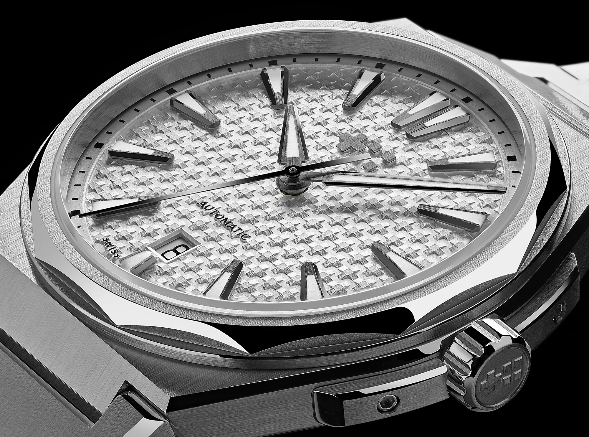
None of this to say that The Twelve is a bad looking watch, it certainly is not. The dial texture that reads close to barleycorn from a distance, is actually a small cross section that’s been raised out of the dial slightly, allowing for light to play between the peaks and valleys. It’s a lovely effect in images, if a touch on the aggressive side, which effectively wrests the focal point away from the angular case.


