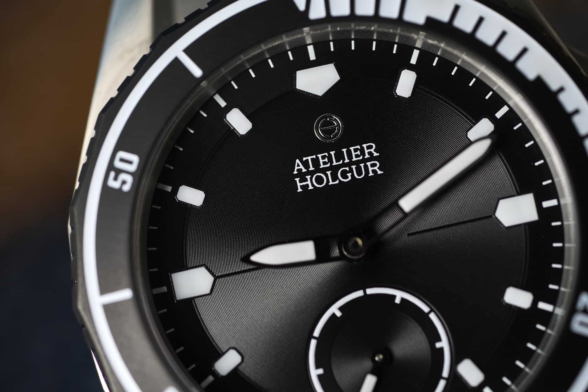
If the case is where the Frømand immediately distinguishes itself, the dial is a slower burn, taking a little more time to fully wrap your arms around. It’s a little jarring at first that there is a complete absence of color. We associate contemporary sports watches, I think, with the playful and respectful use of color, but here everything is deep black or crisp white. It makes for an immediately legible dial that feels stark and minimal, and it does a good job of hiding (and complementing) its key design feature.
The dial is accented with an extremely fine circular snailing pattern that does a great job of picking up light and adding a sense of texture and depth. It really does sneak up on you, though, and sits on the opposite end of the spectrum of something like Grand Seiko’s White Birch, which has ridges that can be spotted from across a room. On the Frømand, the snailing gives the entire dial a subtle sheen, but only when lit obliquely. It’s very well executed, and while I’m sure the pattern is achieved with some type of stamping process, it feels quite a bit more refined than that and adds a great deal of complexity to the whole package.
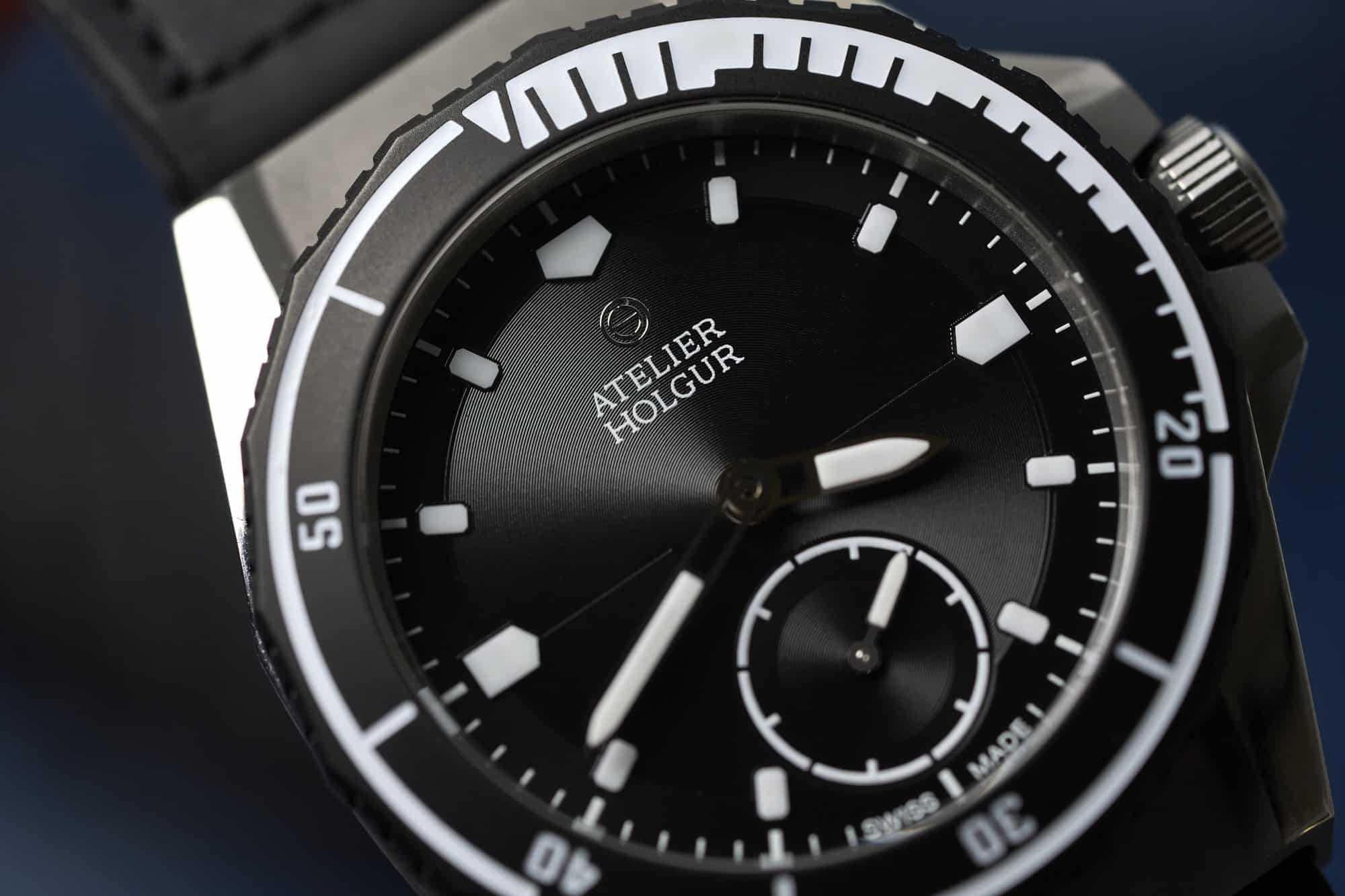
The execution of the dial texture feels strangely like it’s a core component of Atelier Holgur’s mission, which seems to be to create something that’s visually arresting just for the sake of it. This idea really resonates with me, as I’ve leaned heavily into watches of late that appeal to me, for one reason or another, on a purely visual and aesthetic level. I’m less concerned than ever before with practicality, or the “genre” a watch fits into, and adding this type of detail to a dive watch is a small way that Atelier Holgur leans in that direction. We’ve all had experiences where it feels like a brand is in lockstep with your own perspective on watches, and Atelier Holgur approaches that for me at this particular moment.


